Project Focus
Brand Identity, Visual Design, Art Direction
Hooch — Rebranding a natural wine importer into an all-natural beverage company built to own every occasion.
- Brand Identity
- Visual Design
- Art Direction
OVERVIEW
Hooch started as a webshop for imported natural wine — a brand with taste and a following, but someone else's products on the shelves. The pivot changed everything: stop importing, start making. We came in as partners and have been part of building Hooch into an all-natural beverage company ever since — canned natural wine first, then sparkling water, electrolytes, coffee, and beer.
APPROACH
The name says it all — hooch is slang for something homemade, something real. We built the identity around that honesty: black, white, and Manrope kept clean and restrained so the products could do the talking. Every can carries the colour. The brand carries the conviction.

A restrained identity that makes the products the hero
The brand is deliberately quiet — black, white, Manrope — so that every product can carry its own colour and character without fighting for attention. The identity holds it all together without getting in the way.
Built to flex across a full beverage range
Hooch is not one product — it is an expanding range across every occasion. The identity tweak was about building a system that could scale: from the first canned wine to whatever comes next, everything reads as Hooch without the brand having to shout.

A platform for other brands to build on
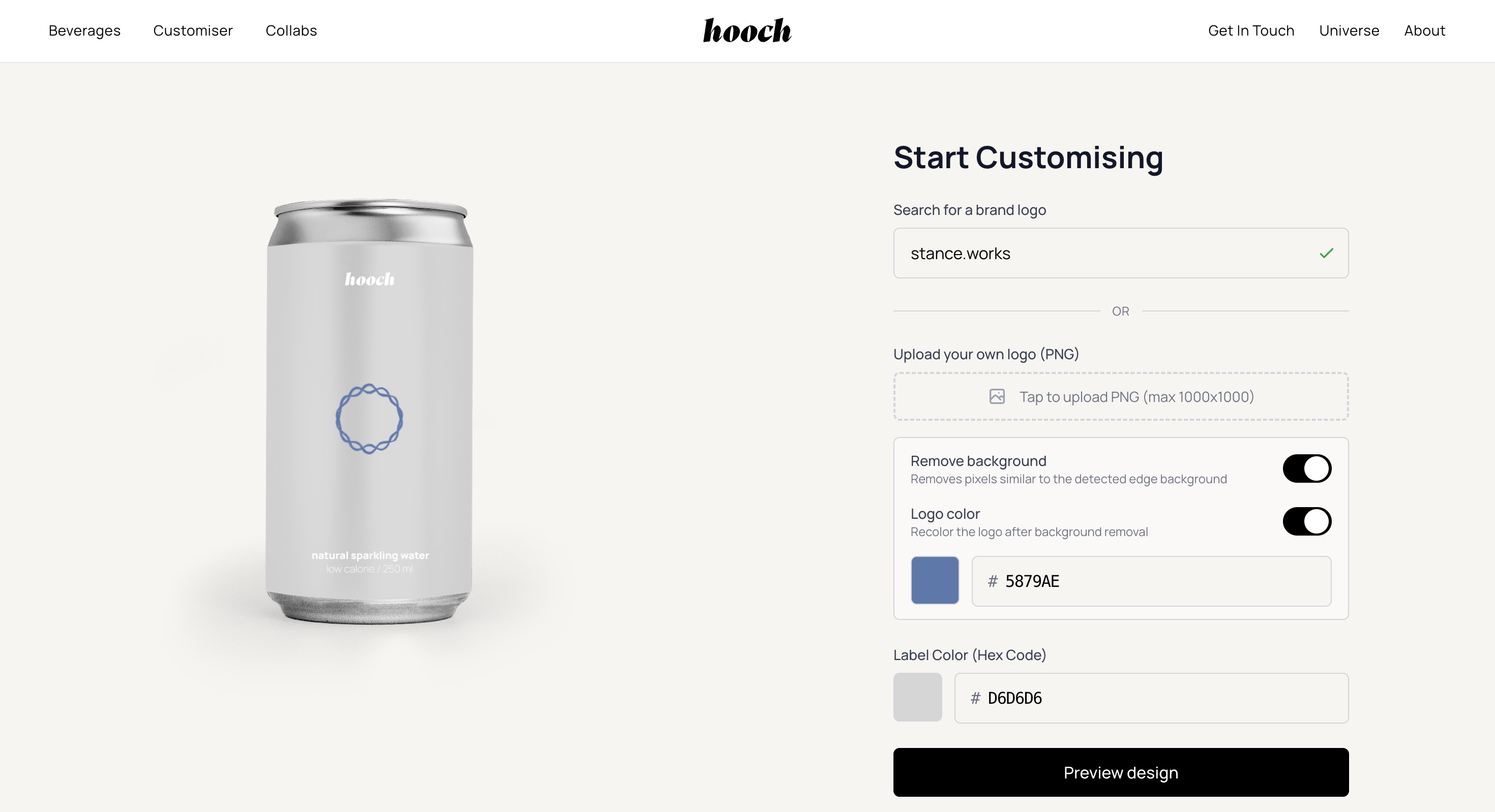
Hooch doesn't just make its own products. Brands come to Hooch for custom natural beverage solutions — their own product, under their own name. The system was designed to accommodate that without diluting what Hooch itself stands for.

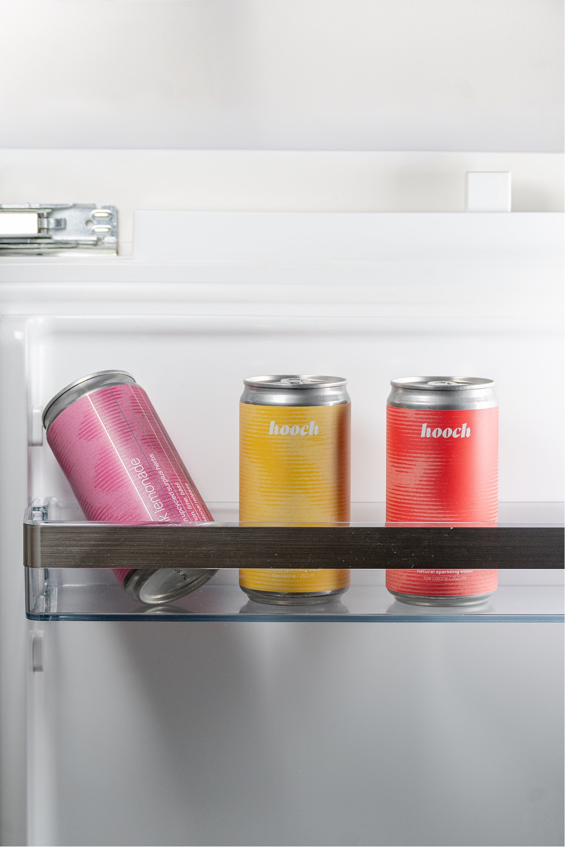
Packaging where the product does the talking
The brand is black and white. The products are not. Each can in the range carries its own colour — making the shelf presence expressive without the identity ever losing control. Natural wine, sparkling water, electrolytes, coffee, beer: each one distinct, all of them unmistakably Hooch.
Every product treated as a design problem in its own right
The range has grown from one product to many. Each addition was an opportunity to extend the visual language — not just fill a gap in the market. Premium enough to sit anywhere, distinctive enough to be recognised anywhere.
A website and photography that sell the brand before the product
Natural beverages live or die on how they are presented. The website and photography were built to do the selling — to make someone understand what Hooch is about before they have read a word.
Shot to make the product impossible to ignore
The photography direction was editorial and precise — treating each can the way a fashion brand treats its product. Every image built to work across website, social, and wholesale materials without feeling out of place in any of them.

Built for the consumer and the buyer
Hooch sells direct and wholesale. The website needed to speak credibly to both without making either feel like an afterthought. Architecture and copy structured so each audience finds what they need without friction.