Project Focus
Concept Development, Brand Identity, Space Design

Nabo — Concept, identity, and space for a bar and burger joint that keeps people in their own city.
- Concept Development
- Brand Identity
- Space Design
OVERVIEW
Nabo is built on a simple belief: you shouldn't have to go into the city to have a great night. A bar, a burger, cold beers, good music — the kind of evening that turns into one more. The concept grew from the heritage of rømers and Lynæs Surfcenter, brought together with a clear vision: set the standard for modern bar and burger experiences outside the big city, and create something worth staying local for.
APPROACH
We started with what Nabo needed to feel like the moment you walked in — fresh but sophisticated, welcoming but confident. A place that takes its food and drinks seriously without taking itself too seriously. From there we built the concept, the identity, and the space around that feeling, so everything from the logo to the interior tells the same story.
The gathering place that doesn't ask you to travel for it
The brief was to create something that could hold its own against anything in the city — and bring it to the neighbourhood. A burger worth coming back for. A bar with events, music, and life. A courtyard where good evenings start naturally and end late.
Fresh but sophisticated, welcoming but confident
The tone of Nabo sits between those two pairs. Energetic enough to draw a crowd, refined enough to keep their respect. The kind of place you go on a Friday and also on a Tuesday — for a burger, a beer, or just because you feel like it.
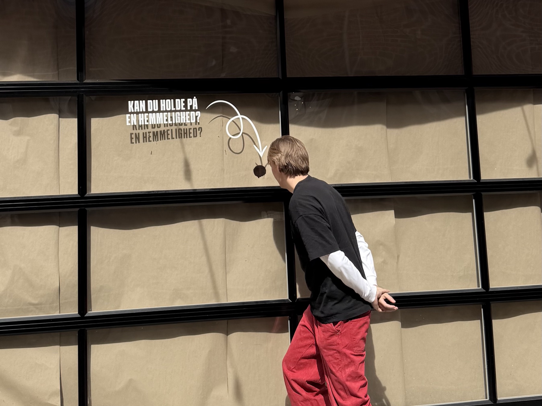
An identity with as much character as the place itself
Nabo's visual language is bold and warm — a brick red that reads from across the street, a condensed typeface built for impact, and a hand-drawn mascot that brings the personality to life. Nothing corporate. Nothing timid.
Built to be seen and remembered
The primary logo is the name, set large and unapologetically. The secondary mark boxes it in like a stamp. The mascot — a hand-drawn figure — carries the energy: loose, alive, unmistakably Nabo.
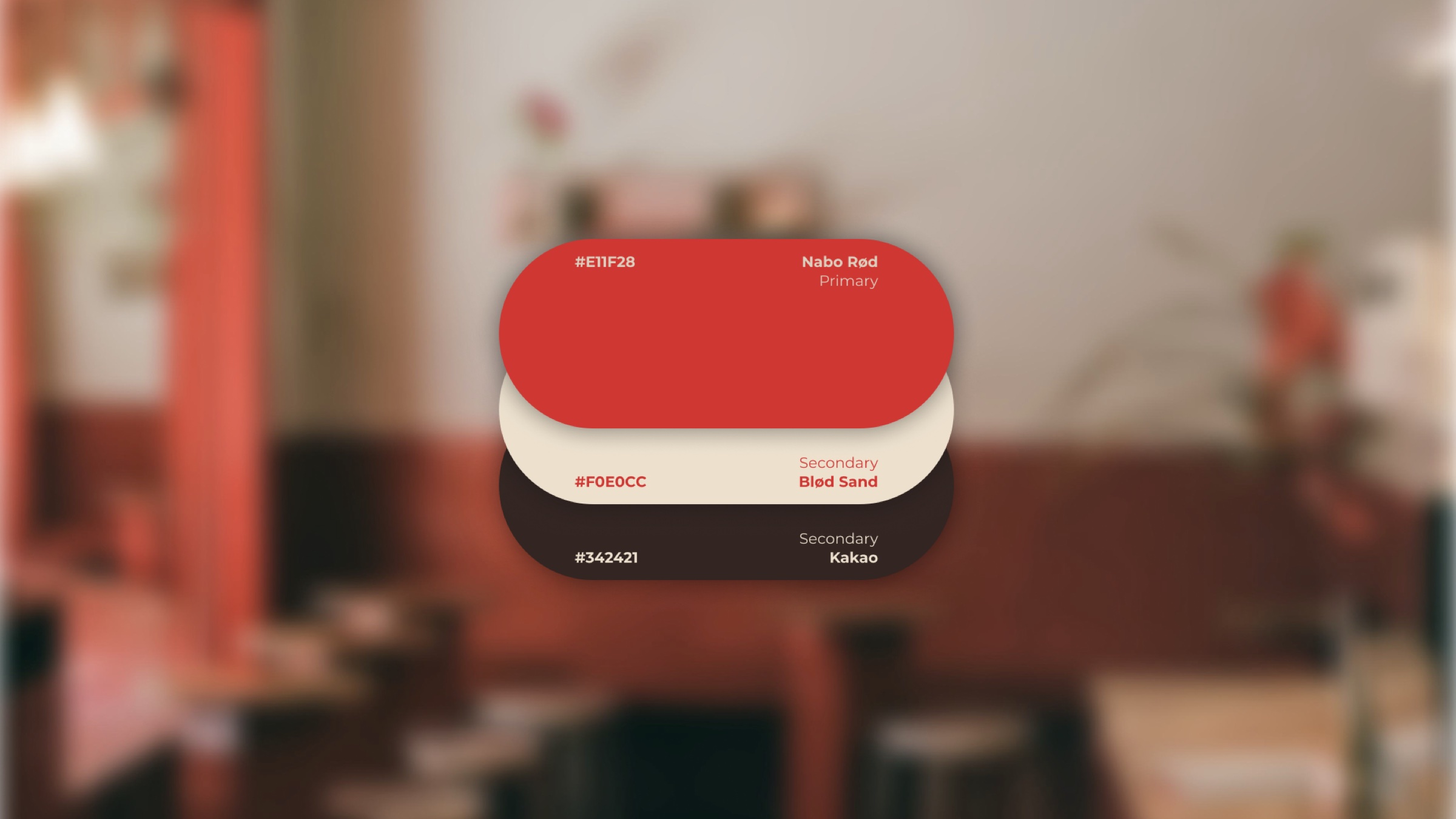
Warm, energetic, and always on brand
The colour palette is led by a warm brick red with a dusty cream, a dark charcoal, and a deep green in support. Schabo in full caps for the statements that need to land. Montserrat for everything that needs to be read. And Reenie Beanie — handwritten, used sparingly — for the moments that need a human touch.
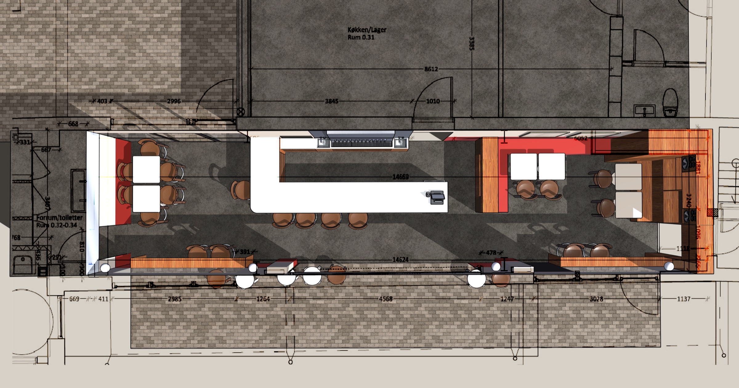
A space designed around the feeling, not the floor plan
The interior was designed to feel like the brand the moment you walked in. Every material choice, every seat, every corner of the courtyard considered against the same question: does this feel like Nabo?
The bar, the courtyard, the terrace — all of them Nabo
The space had to work for a quick burger at lunch and a full evening at the bar. Relaxed enough for both, designed well enough that you notice. The courtyard sits at the heart of it — the kind of space that gathers people without trying.