Project Focus
Brand Identity, Visual Design
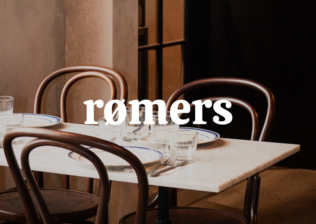
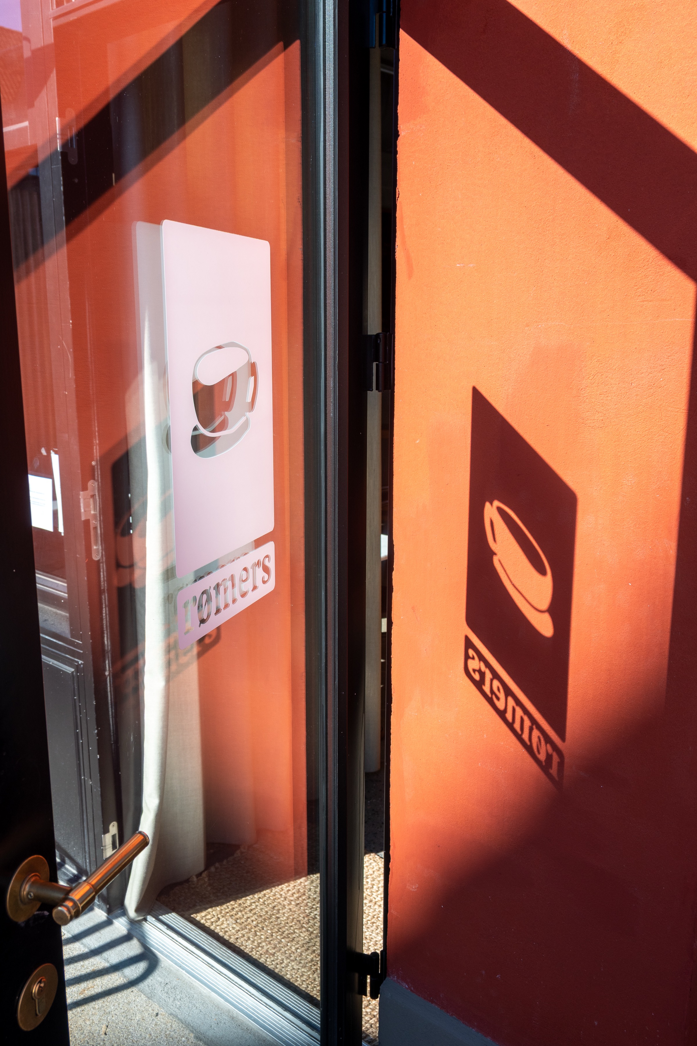
rømers — Identity and website for a place built around taste, life, and the people who show up for both.
- Brand Identity
- Visual Design
OVERVIEW
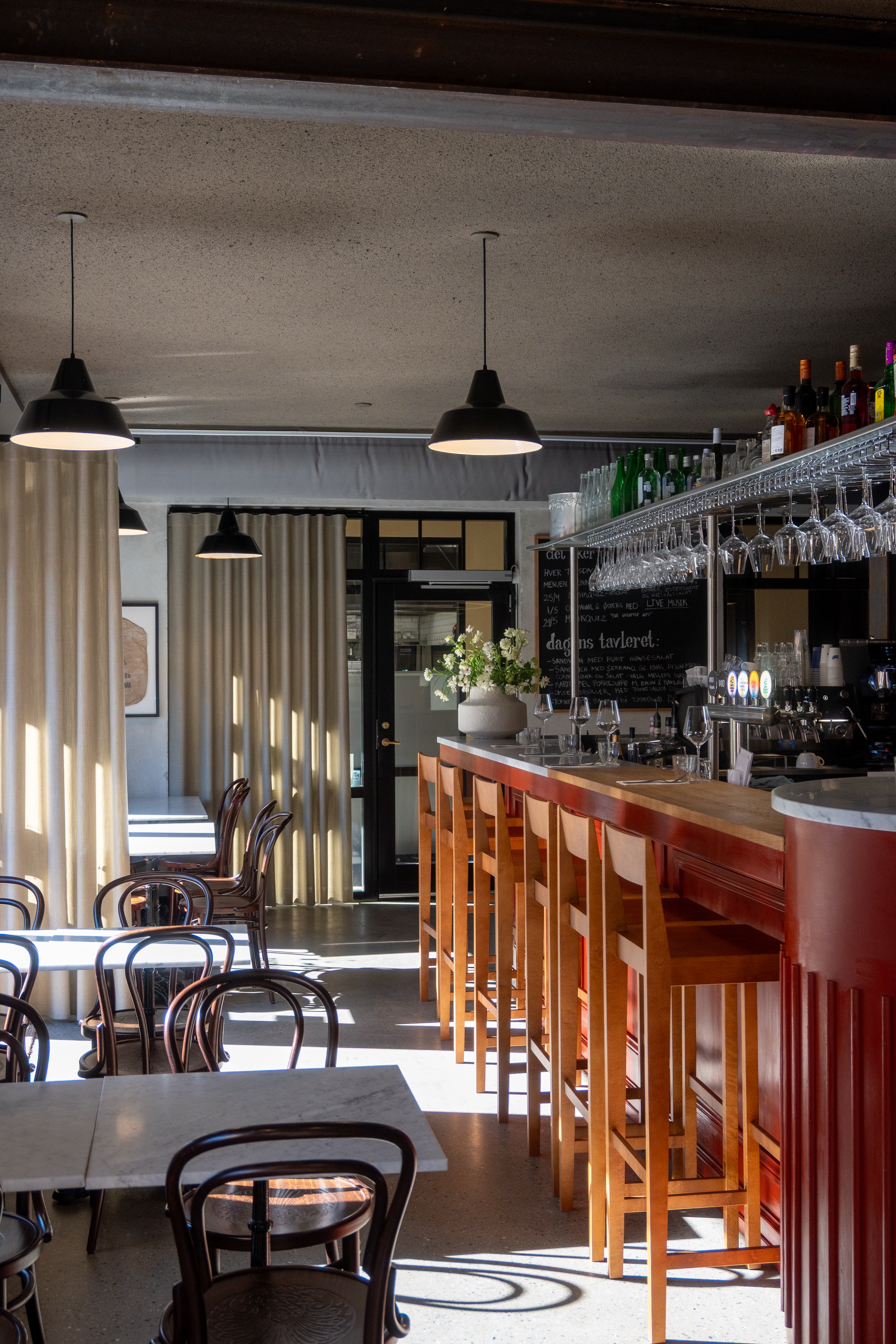
rømers is a family-run French bistro in Hillerød — a gathering place from morning to midday to evening. They call it stedet for smag & liv: the place for taste and life. The brief was to build a visual identity and website that could carry all of that — personal enough to feel like a family place, considered enough to hold its own as a proper bistro.
APPROACH
We started with what makes rømers itself: the people behind it, the culture they wanted to create, and the role the place plays in the neighbourhood. From there, three decisions shaped everything — a French serif, a royal blue, and hand-drawn illustrations. Together they gave the brand warmth and weight in equal measure.
Building an identity that feels as warm as the place itself
The challenge was to make something professional enough for a proper bistro but personal enough to reflect the family behind it. rømers needed to read as considered without feeling corporate — and as warm without feeling amateur.
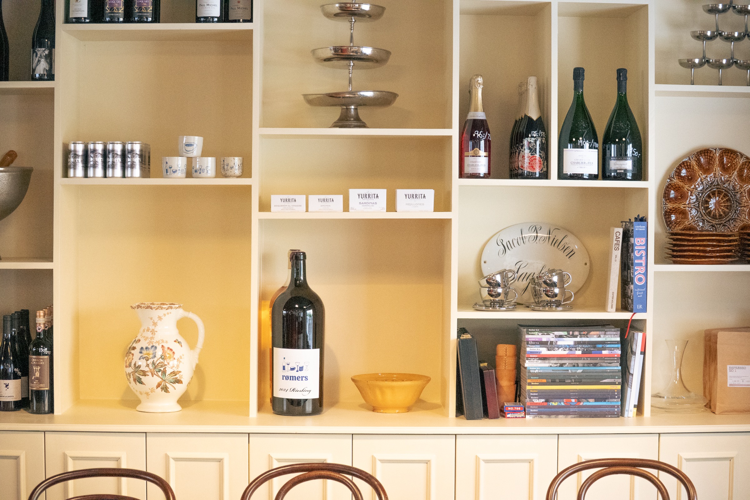
French inspiration, rooted in something genuinely local
The identity draws from French bistro culture — a serif typeface, considered layouts, a sense of occasion. But it is grounded by something more personal. Hand-drawn illustrations brought in the human element, making it clear there are real people behind the brand.
A system built for a place that is always on
With events at the heart of what rømers does, the visual system needed to handle a high frequency of communication without losing its character. Every poster, menu, and announcement feels like it came from the same place.

A visual language built from three decisions
French serif. Royal blue. Hand-drawn illustrations. Every element of the identity follows from those three choices — a typeface that carries weight and warmth, a colour that reads as considered without being cold, and illustrations that make it unmistakably human.
Built to be used by the people who run the place
A brand is only as good as how it is used day-to-day. We built a system that the rømers team could apply consistently — menus, event graphics, social, signage — without needing a designer for every decision.
Hand-drawn to make it feel like someone made it
The illustrations are the heart of the identity. Each one was drawn to feel specific to rømers — not generic bistro imagery, but something that could only belong here. They carry the warmth and personality that typography alone cannot.

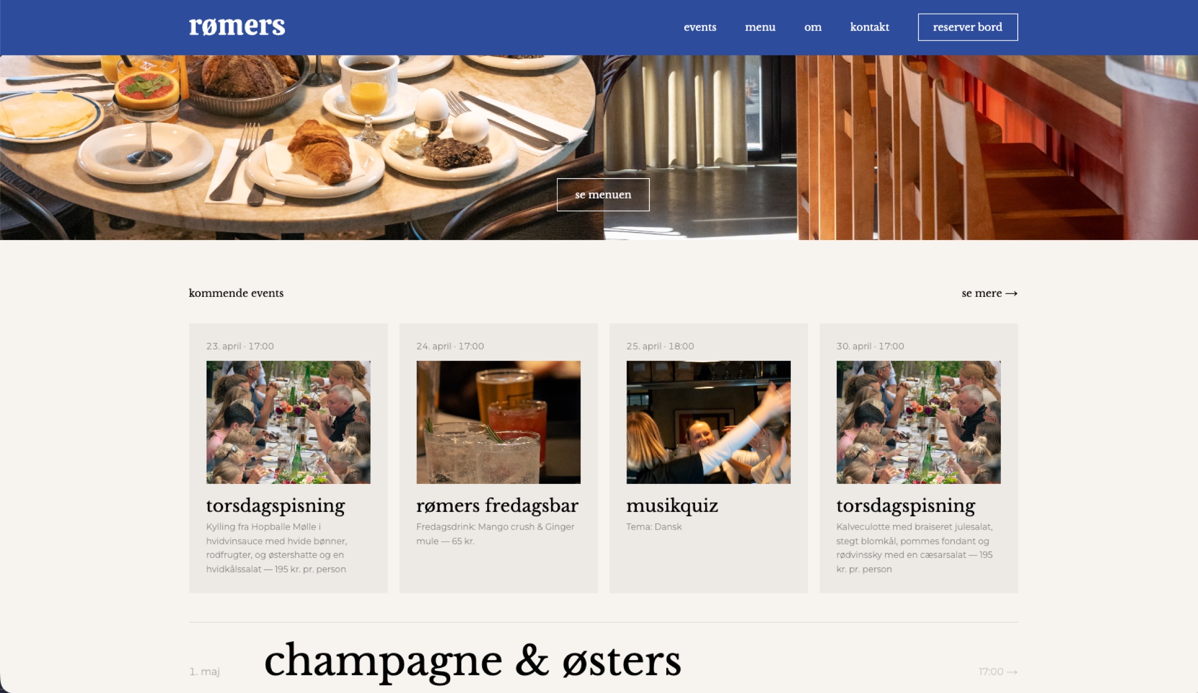
A website built around what actually brings people in
The rømers site is built around the things that matter — what is on, what is on the menu, and how to book. Architecture kept simple, design kept warm, so the site feels like the place rather than just a page about it.
Events, reservations, and the menu — all in one place
The site handles the full guest journey — from discovering what is on to booking a table. Built so every event and menu change can happen without friction.